Overview
Context
Image Credit:
Jefferson Y. Sheng, 2022
Brandon Vallejo, 2025
Anthony Lee, 2023
Problem
Insight
Solution
Image Credit:
Max Mielcarek, 2024
Cheryl Yan, 2024
Outcome
Takeaways
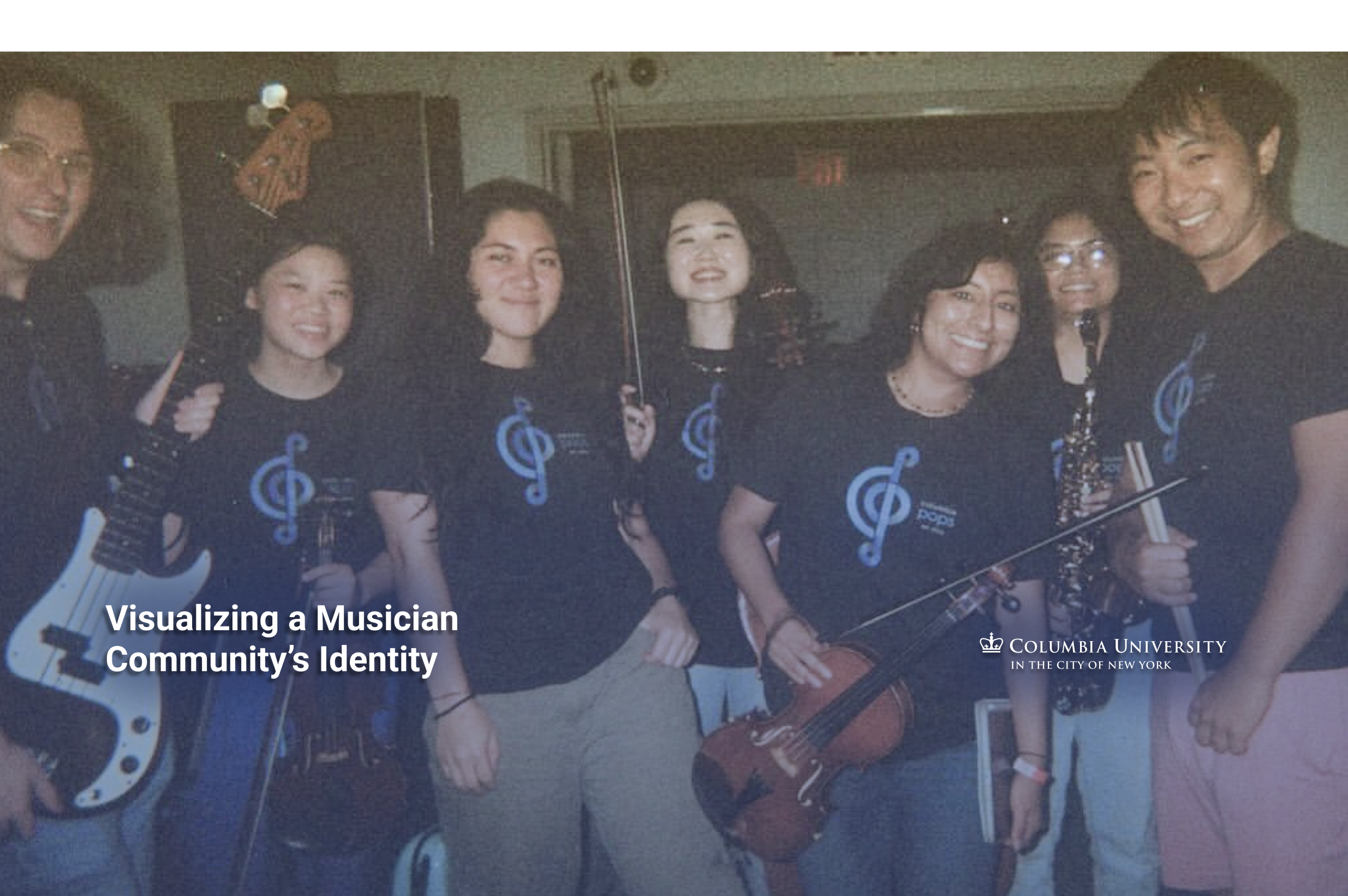
I redesigned the official logo and visual identity for Columbia University Pops Orchestra, a 100+ member student ensemble that has been the key pillar of Columbia’s music scene since 2014. The new identity replaces a decade-old borrowed icon with an original visual language rooted in universal musical symbols and Columbia blue, which members now proudly wear on merchandise and represent at official university events.
Role:
Visual Designer
Media Coordinator
Timeline:
Aug 2023-Jan 2024
Tools:
Adobe Illustrator, Lightroom, Procreate, OBS
Collaborators:
Columbia Pops Student E-Board
Student Musicians
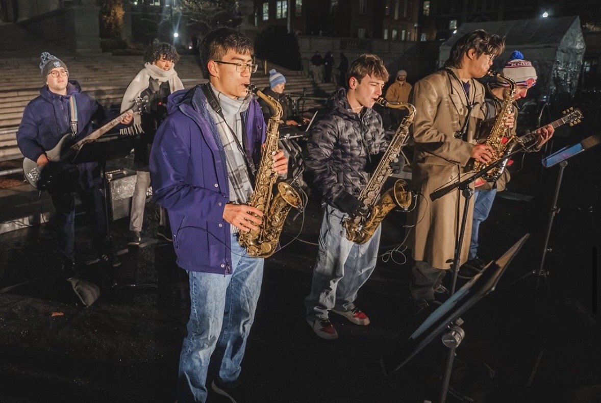
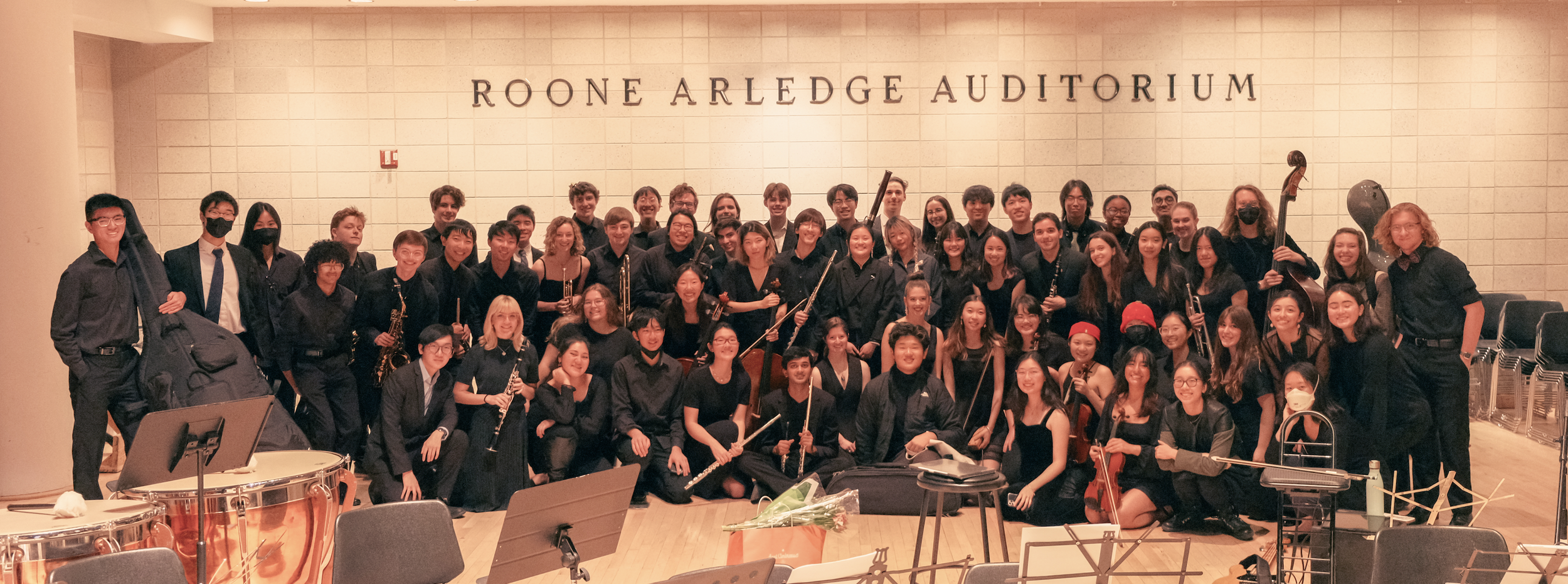
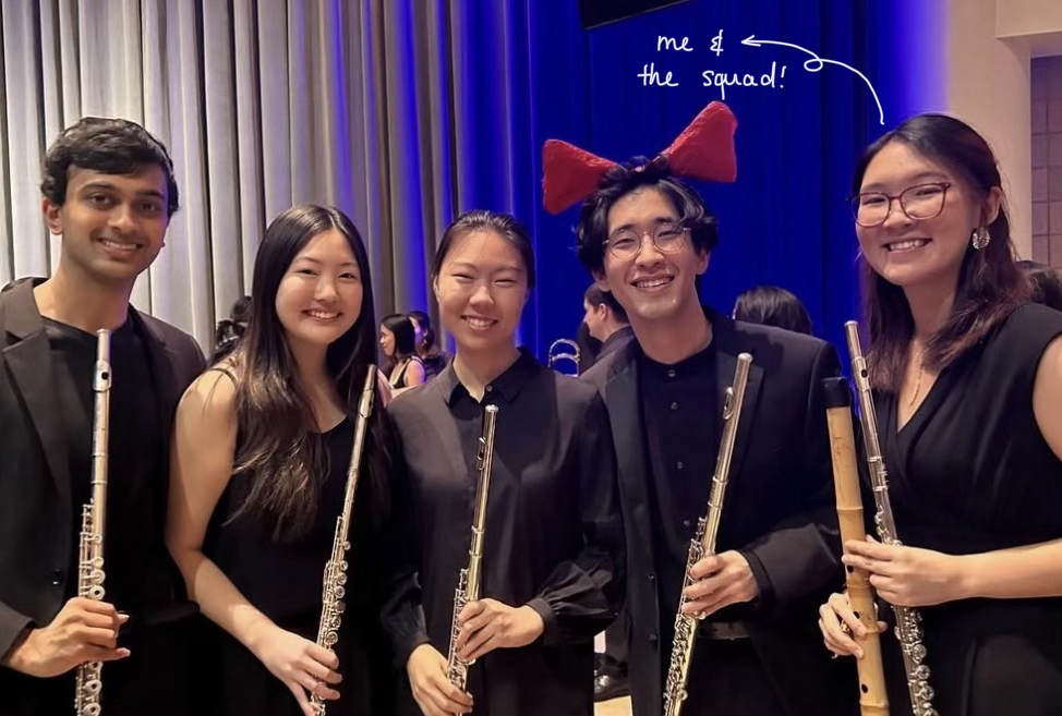
As Columbia University’s premier pop music orchestra, Columbia Pops↗ has been performing student-arranged music from anime, film, and pop culture since 2014. The group organizes seasonal concerts and performs at official university events year-round, including new student orientation, Christmas tree lightings, and industry galas.
While known for playing diverse music genres across campus, Columbia Pops commits to having fun & community-building first. Kindness and support come before perfect skills and prestige, and this ethos has enabled the orchestra to attract over 100 musicians from across Columbia's undergraduate and graduate schools.
For 10 years, Columbia Pops’ logo has been the silhouette of Totoro, Studio Ghibli’s iconic character that perfectly captured the group's warmth. approachability, and love for anime. It made perfect sense in 2014. But as the organization grew into a credible fixture of university life, the logo's borrowed identity created copyright issues and just seemed a little childish. A beloved community had outgrown its borrowed identity.
Relying on someone else's IP wasn't sustainable, and a decade of informal logo variations across platforms had left the visual identity fragmented and inconsistent. Hence, the challenge wasn't just designing a new logo, but also finding a visual language that could carry 10 years of community feeling, without compromising professionalism and losing the spirit that made people fall in love with the group in the first place.
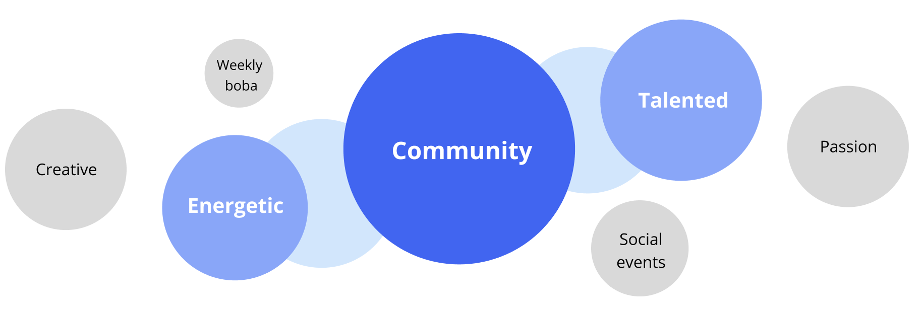
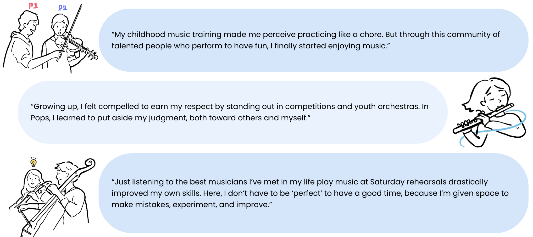
To understand what a new identity needed to carry, I sat down casually with 35 musicians and 16 student executive board members, hearing their stories based on 1 simple question: What makes Columbia Pops unique?
People’s stories ranged widely, but 1 clear similarity emerged. Members value musicianship and craft. However, people didn’t lead with the music, but with the community. They shared how much they grew as musicians through collaboration, about the self-driven energy of showing up to extra rehearsals, about weekly boba runs and feeling genuinely supported when they struggled with non-music matters. The logo needed to hold all of that: not just a professional music group, but a tight community that thrives together.
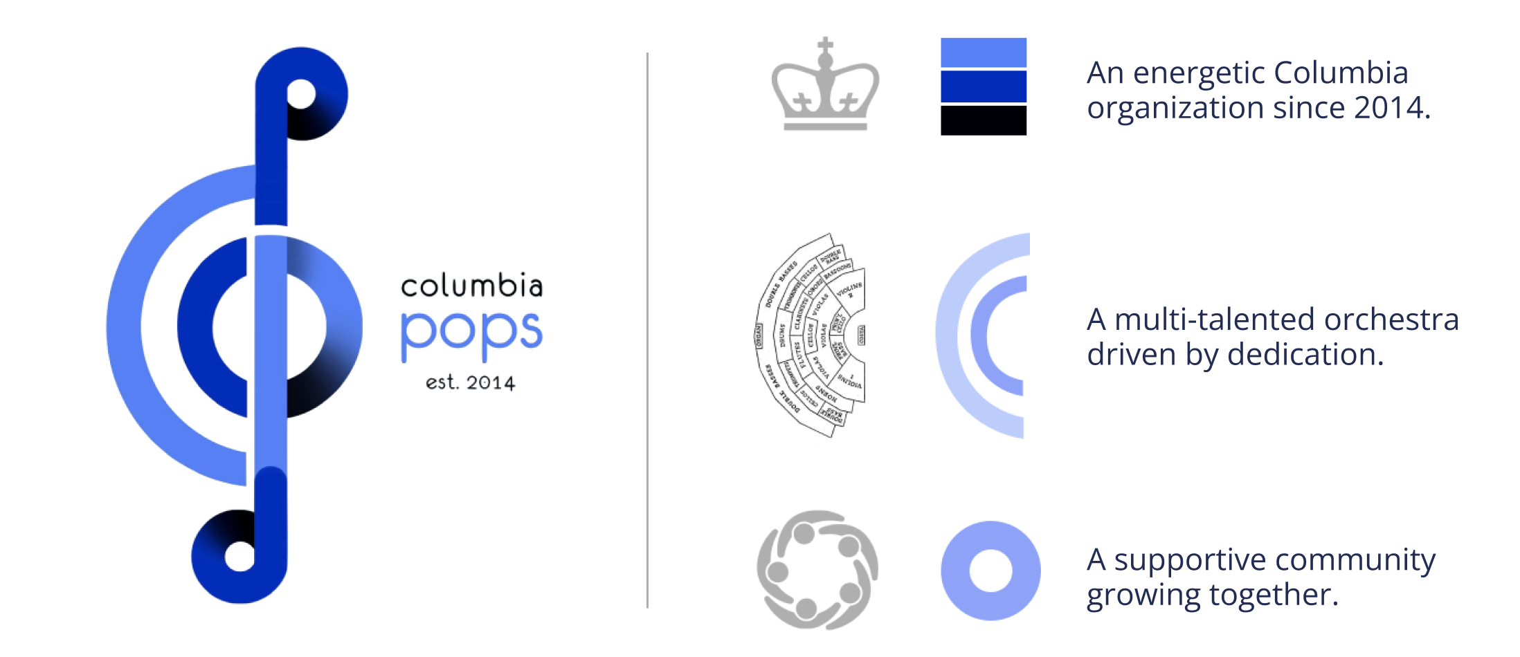
Rather than designing something entirely new and unfamiliar, I first studied the visual languages of internationally renowned orchestras to find what musical symbols feel instantly recognizable and carry weight. From that research, I extracted a set of musical marks that anyone (musician or not) could connect with. To ground the identity in Columbia, I kept the blue palette that members already associate with the organization and the university. The result is a logo that feels familiar enough to not feel like a departure, distinct enough to finally be its own.

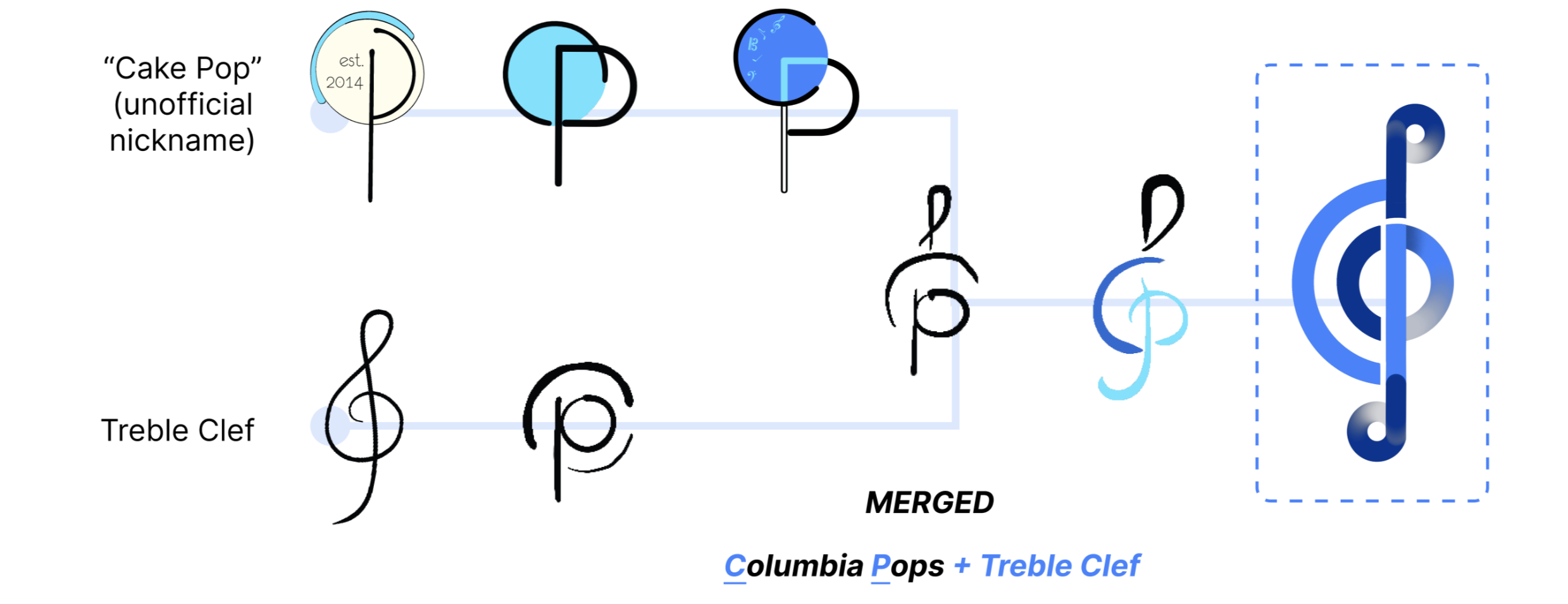
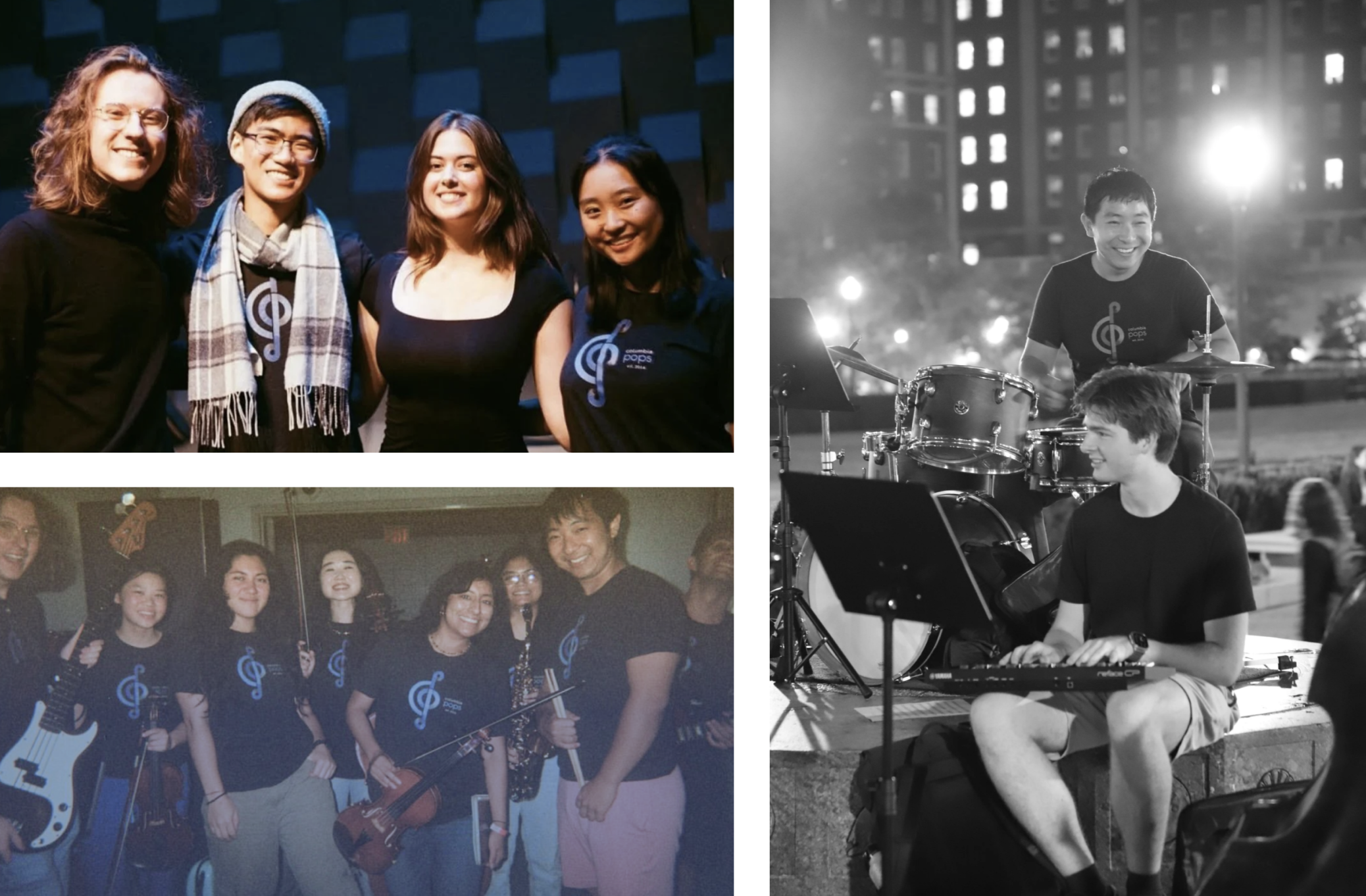
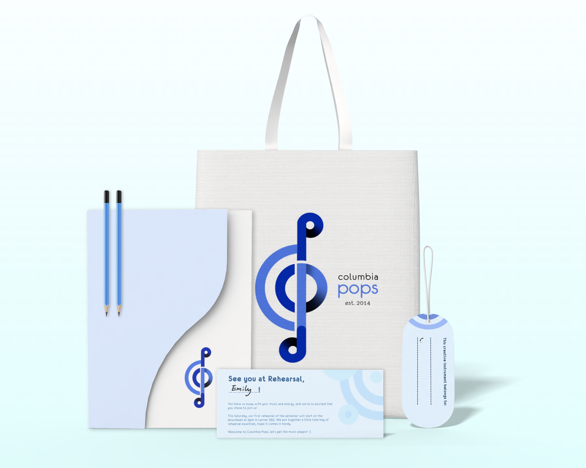
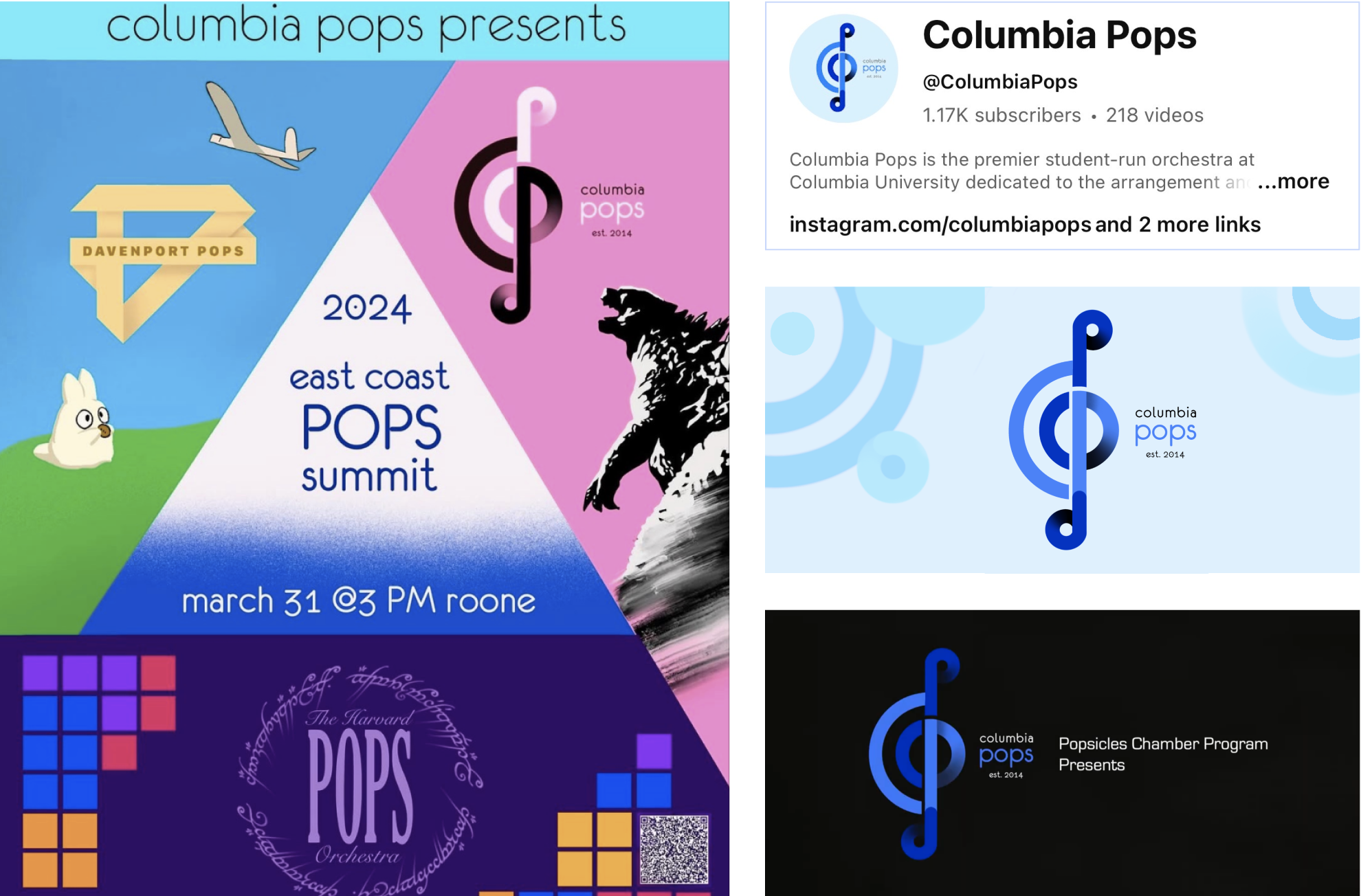
The new identity is now live on Instagram and YouTube, printed on merchandise and t-shirts, and worn at official university events. As the Media Coordinator on the executive board, I facilitated in-person and online implementation. Watching our musicians represent the new logo at performances made the impact tangible. The redesign, beyond solving an IP problem, also gave people a common visual identity they are proud to share because it represents them.
Enhanced public visibility
Within 10 months since launching the new visual identity, Columbia Pops’ Instagram followers increased by 34%. Collaborations with other university organizations and administration teams also grew.
Attracted more ethos-aligned talent
When we asked 30 new auditionees how they learned about Columbia Pops, the most common answer was a “social media identity that felt fun and credible at the same time“. Incoming musicians cited the "professional but welcoming" image as a key factor in their decision to join.
Deepened member commitment
After replacing scattered logos with 1 unified identity, current musicians shared feeling greater sense of pride and unity in representing the organization at public events.
Design for emotional delight first
Treating community members as co-creators — not just end users — meant the final identity wasn't imposed on them. When people see the new logo on a t-shirt or a stage backdrop, they recognize something of themselves in it. That recognition is the real deliverable.
Translating feeling into form begins with research
A community’s unique spirit doesn’t come with a style guide. To find the best visual language that turns 10 years of warmth, belonging, and shared experience into a mark people immediately recognize as theirs, I synthesized how visual symbols used by the world's most enduring music organizations carry weight.

Spring 2024 East Coast Pops Summit @ Columbia, in collaboration with Pops Orchestras from Harvard and Yale
Videography cr. Carl Keng Seng. YouTube management and logo design by me.