Overview
I designed a brand identity balancing professionalism with community warmth, solving copyright issues while preserving what musicians love about Columbia Pops
My Role:
Media Coordinator
Flutist
Collaborators @ Columbia University Pops Orchestra:
35 musicians of Columbia Pops
16-person executive board (presidents, secretaries, music directors, treasurers, chamber music directors, media coordinators)
Timeline:
July 2023 - February 2024
Extracurricular Activity @ Columbia University
What I Did:
User interview, brand strategy implementation
Logo design, poster graphics, photography, videography
Context
As Columbia University’s premier pop music orchestra, Columbia Pops has been performing for 10 years. Columbia Pops commits to having fun & community-building. This ethos has attracted 100+ talented musicians across campus.
Problem
The orchestra’s logos borrowed unoriginal imagery and inconsistent branding
This risked:
Copyright vulnerabilities from using existing icons
Reinforcing inconsistent brand identity across public-facing materials
Insight
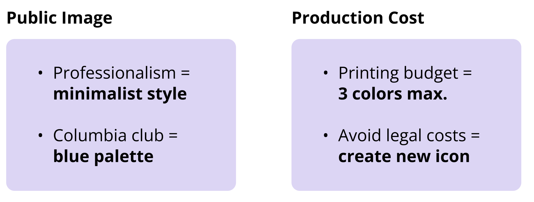
The executive board wants a balance of professionalism & cost-effectiveness.
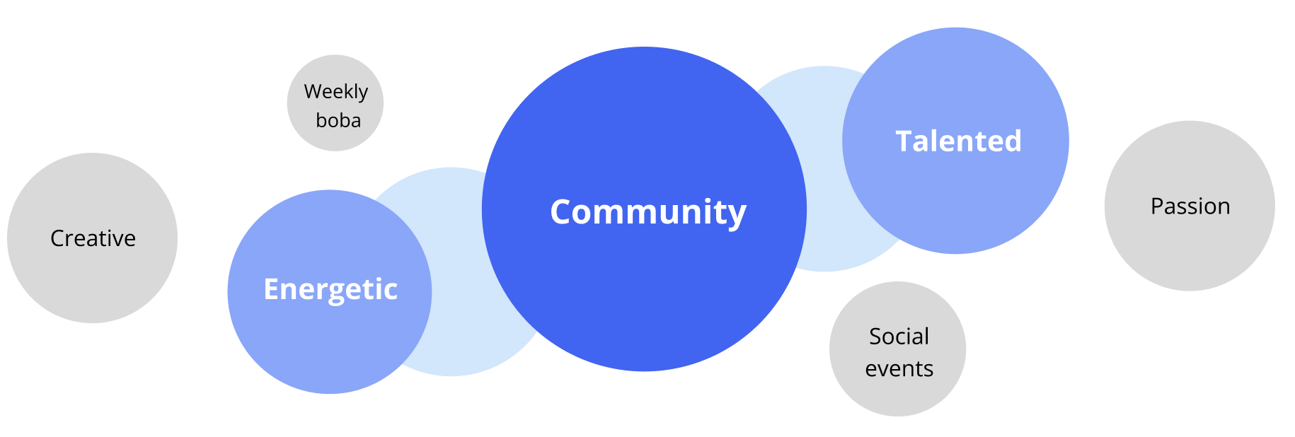
Asking our musicians to describe Columbia Pops with 3 words, I uncovered that musicians care more about the organization’s emotional value.
How can we create a brand identity that projects professionalism, while preserving the energy & sense of community that musicians cherish?
Solution
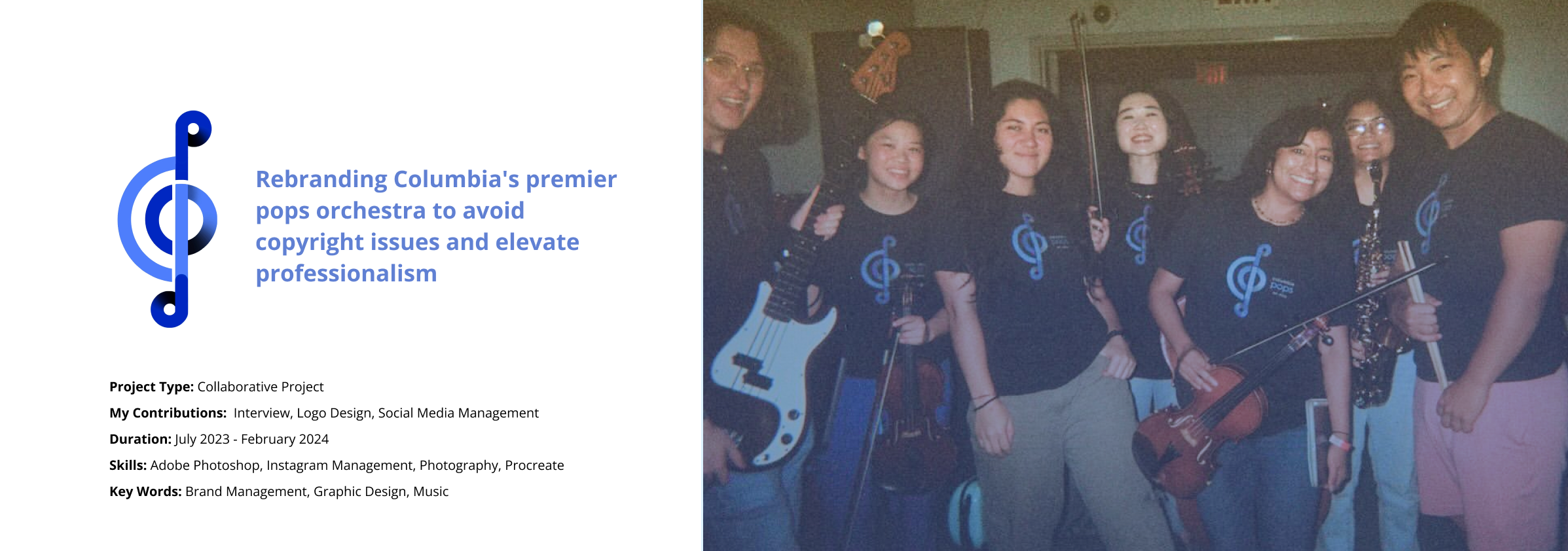
I designed and implemented a new visual system that balances institutional credibility with approachable warmth.
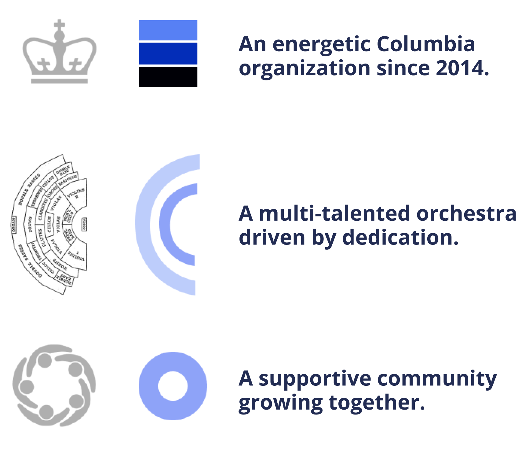
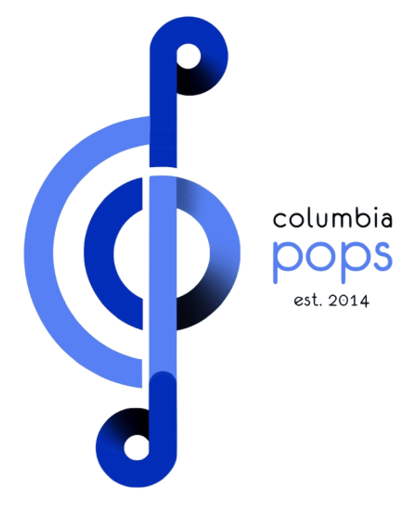
Making 3 core values visible in the logo design.
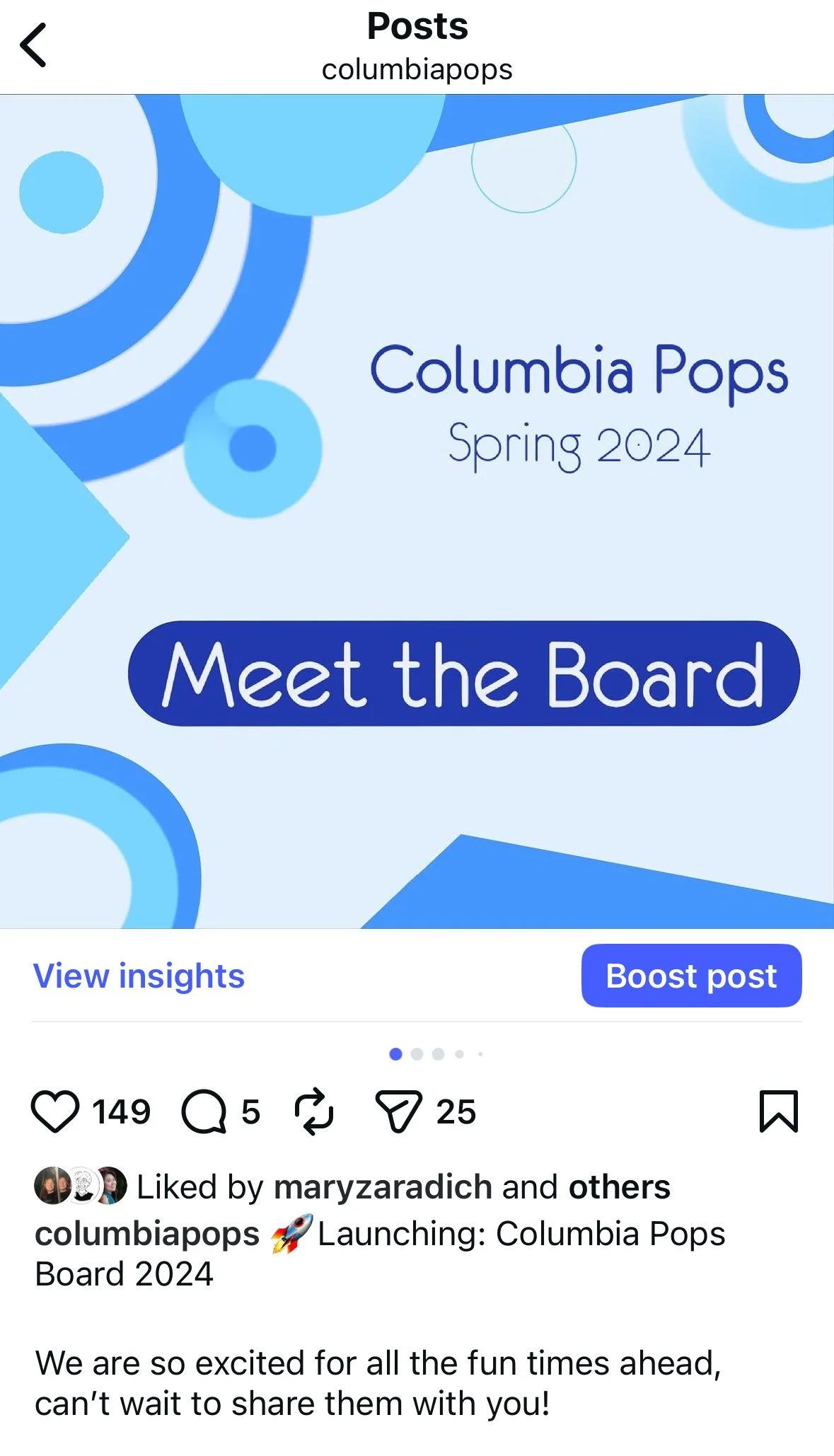
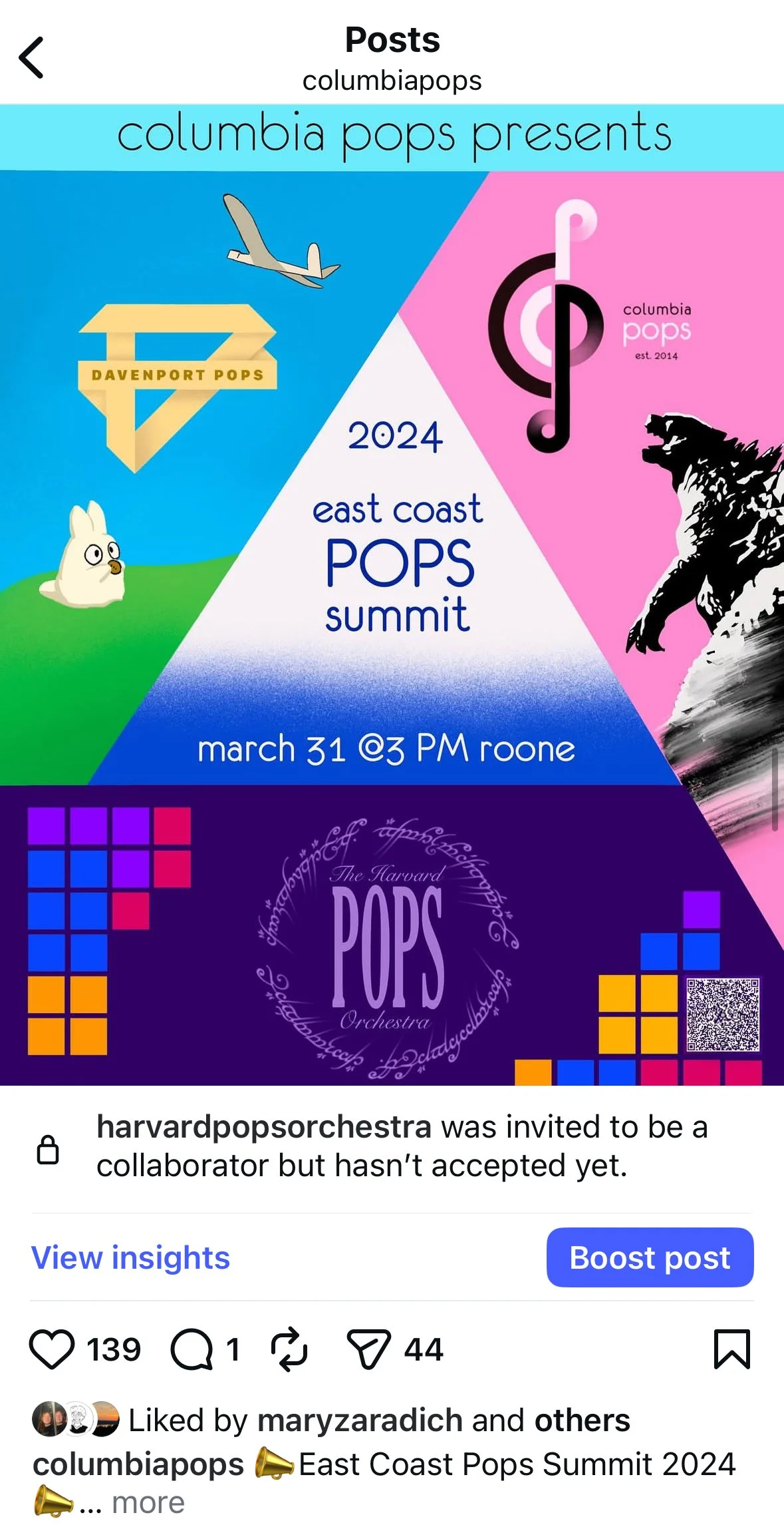
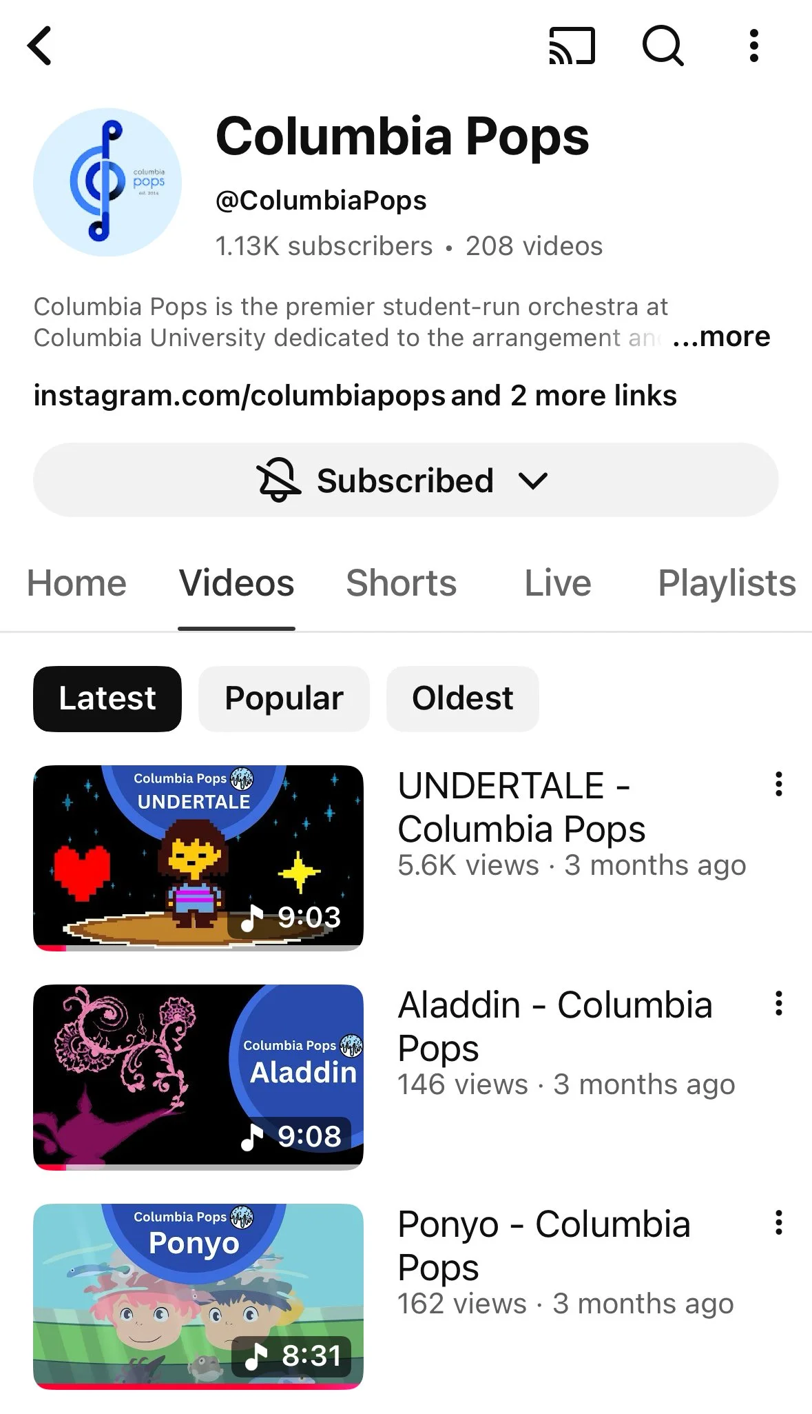
Visual identity implemented consistently across online platforms.
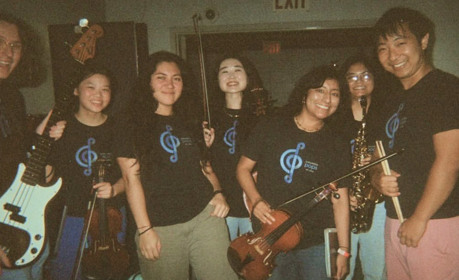
The visual system is physically implementation via printed merchandise that our musicians show off at paid gigs and public concerts.
Outcome
Enhanced visibility
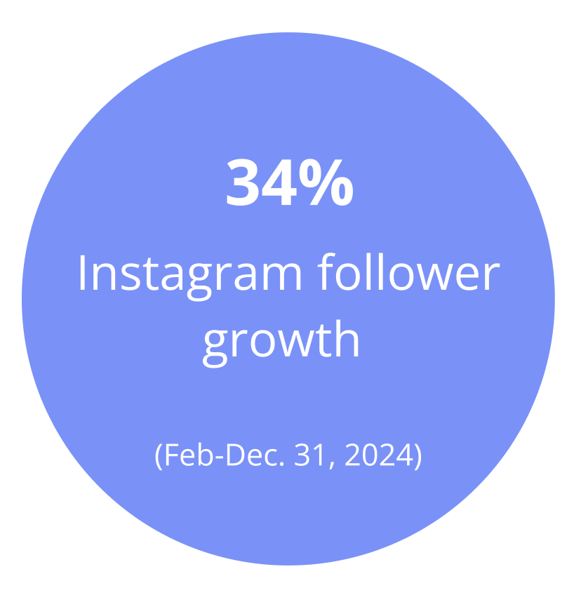
Social media engagement increased, elevating Columbia Pops' profile across campus.
Attracted 26% more collaborators.
Attracted aligned talent
The new brand presence drew 18% more audition applications.
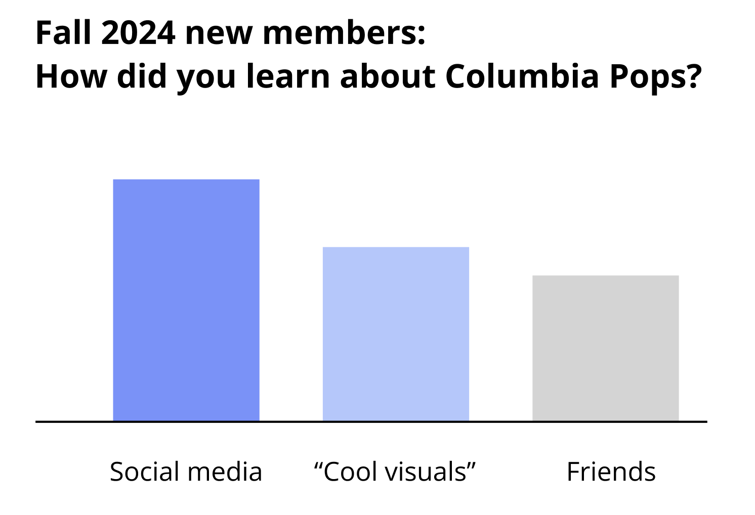
Incoming musicians cited the "professional but welcoming" image as key factor in their decision to join.
Deepened member investment
Current musicians reported feeling greater pride in representing the organization.
design process
Logo Analysis
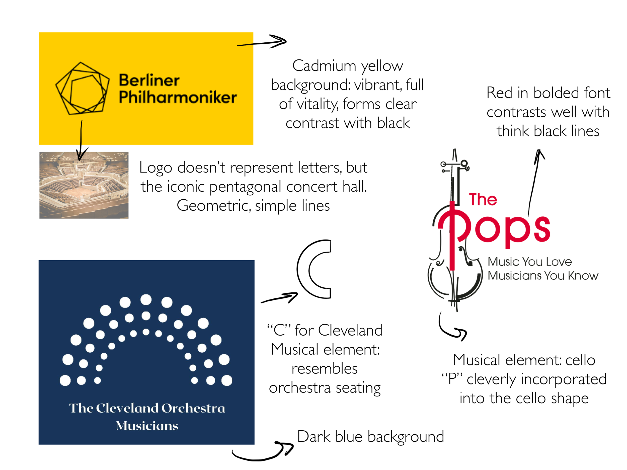
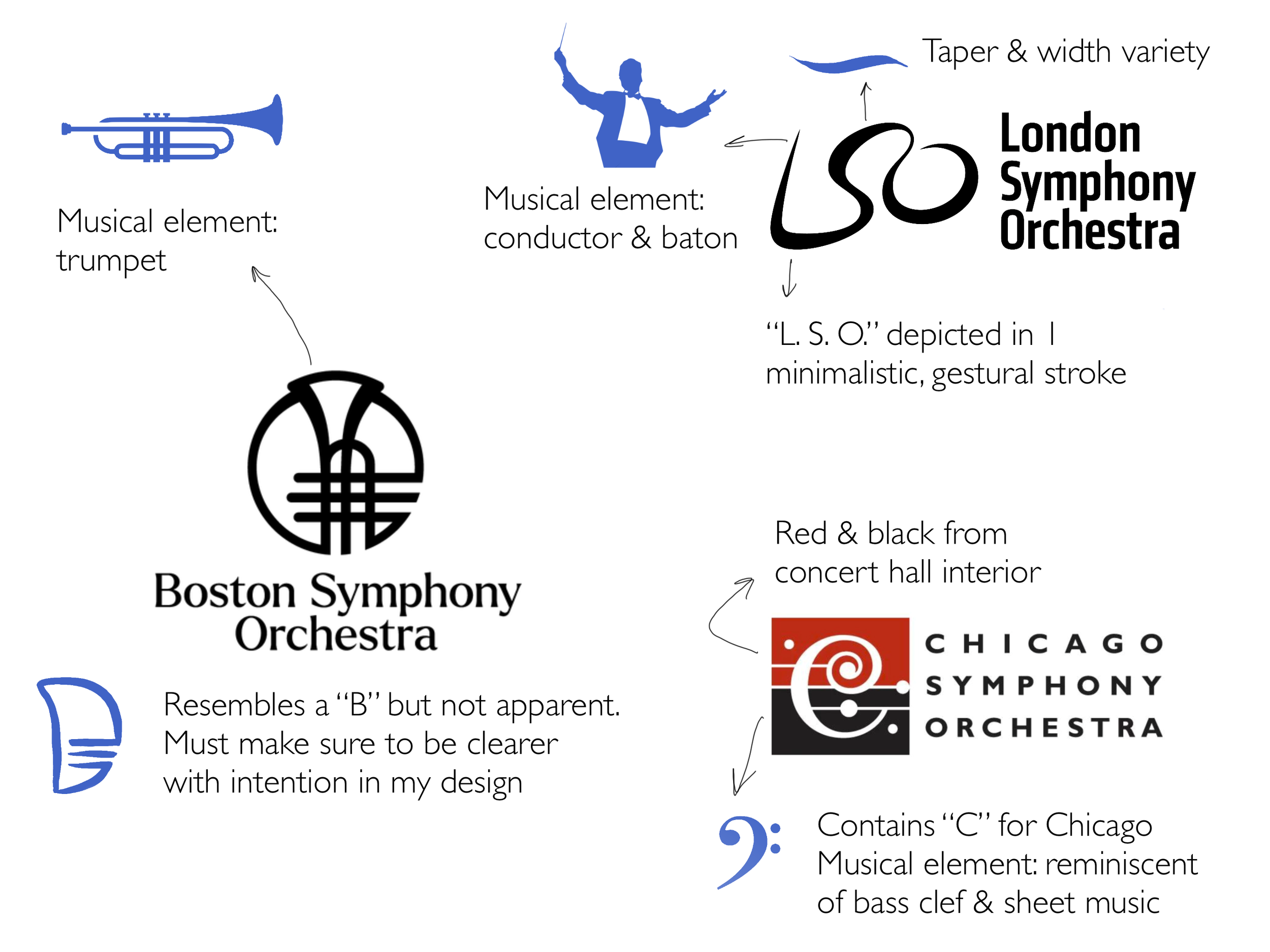
3 insights emerge after studying 6 famous orchestra logos
Convey “orchestra“ identity via musical symbols.
Hide alphabet abbreviations into logo to achieve both clarity & minimalism.
Use color to project emotion or associate with location.
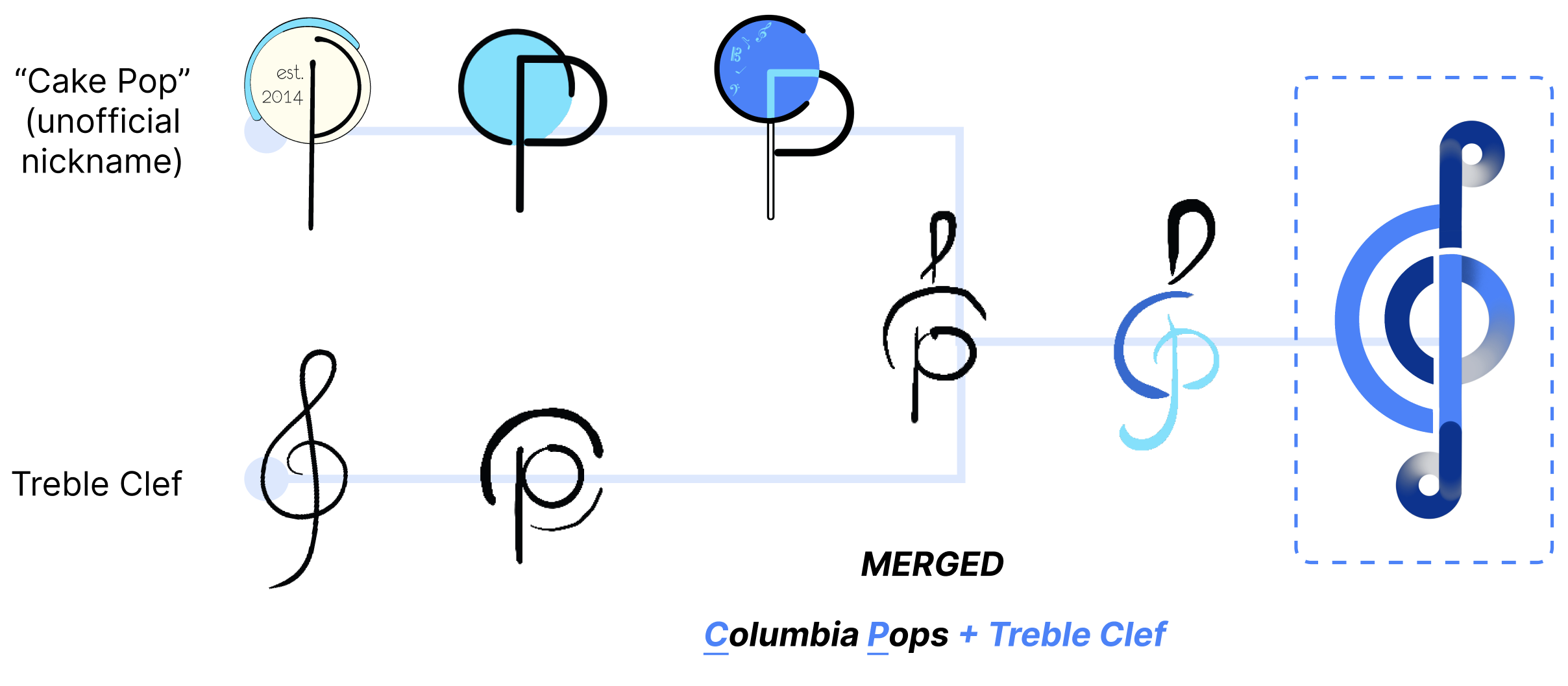
Design Iteration
The prototype of the final logo comes after combining 2 separate explorations.


