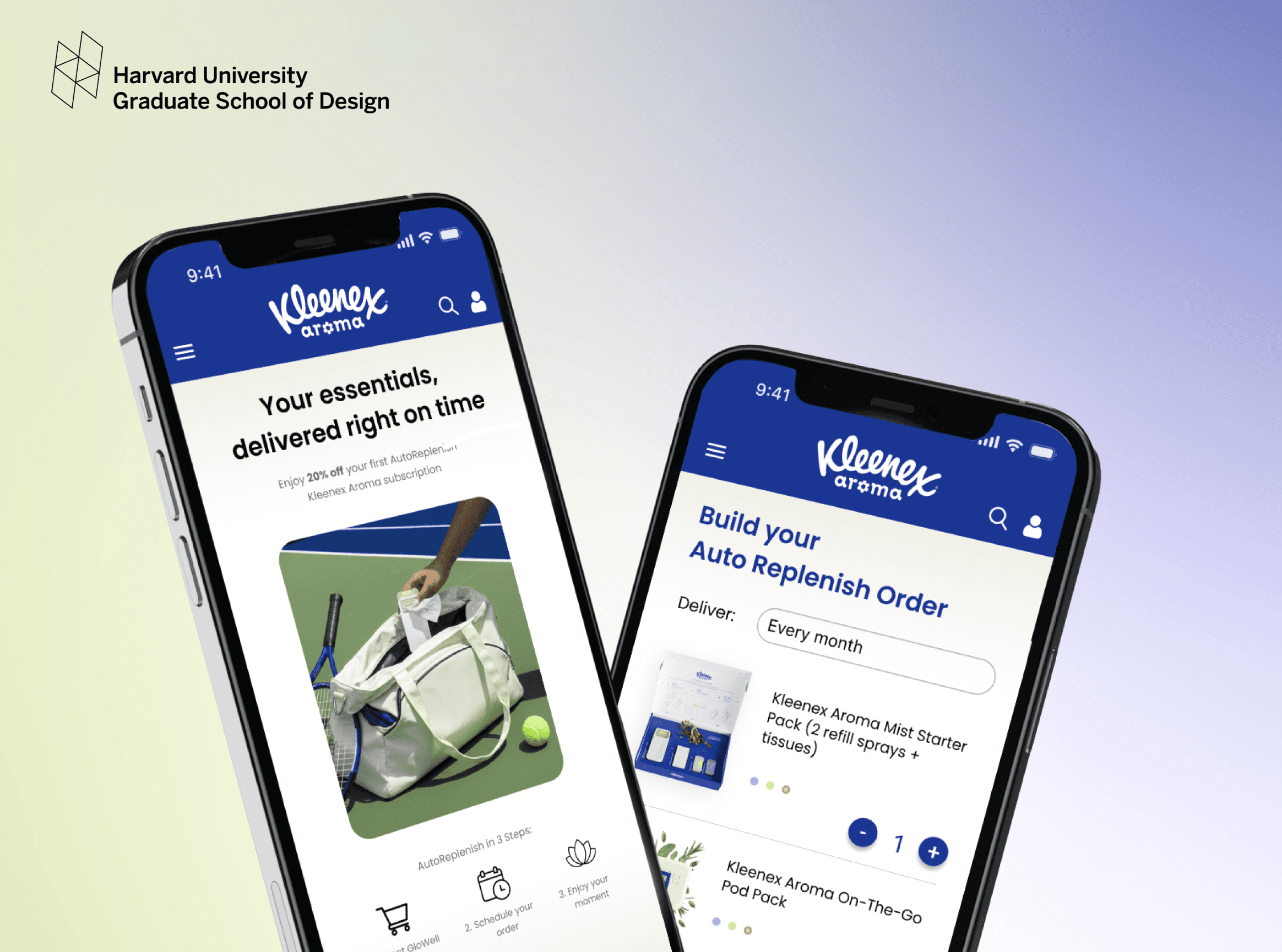
Kleenex & Harvard GSD
2026
Building a musical community's identity
Designing a new product line and brand system for Kleenex after its parent company divested its international sector.

Overview
Columbia University Pops Orchestra ↗ is a 100+ member student ensemble that has been a pillar of Columbia's music scene since 2014. It performs student-arranged anime, film, and pop music at seasonal concerts and official university events, and it puts community before perfection.
I redesigned the orchestra's logo and visual identity, replacing a decade-old borrowed icon with an original mark rooted in universal musical symbols and Columbia blue. As Media Coordinator, I also rolled it out across social, merchandise, and university events.
Outcome
Concept
Challenge: A community that outgrew its borrowed identity
For 10 years, Columbia Pops used a Totoro silhouette as its logo. It captured the group's warmth in 2014, but as the orchestra became a credible fixture of university life, the borrowed IP created copyright issues and felt childish. A decade of informal logo variations had also left the identity fragmented. The task was a visual language that carried 10 years of community feeling without losing the spirit people fell in love with.
Insight: A musical identity that leads with collaboration
I asked 35 musicians and 16 executive board members 1 question: what makes Columbia Pops unique? Members value musicianship, but community came first. They talked about growing through collaboration, showing up to extra rehearsals, and weekly boba trips. The identity had to hold a tight community, not just a professional ensemble.
Solution: A unique design that balances familiarity and professionalism
Studying the visual languages of global orchestras inspired me to combine the treble clef symbol and Columbia Pops' initials "C & P." The result is an original mark that musicians instantly recognize, and also establishes distinctiveness that helps Columbia Pops stand out among other university bands.
The blue palette preserves Pops' association with Columbia University, while communicating elegance and trust. Circular motifs across icons, graphic design, and mockups serve as a metaphor of community and support.
Strategy
Exploring interface directions
I explored multiple layout directions focused on balance visibility, transaction context, and workflow clarity. Each concept tested different approaches to grouping financial information, simplifying navigation, and helping users scan important details faster.

Exploring different dashboard concepts focused on hierarchy, transaction visibility, and clearer everyday financial workflows.
01
Focused overview
Explored a simplified top-level summary with clearer balance visibility and primary actions.
02
Modular layouts
Tested flexible dashboard blocks to improve grouping, spacing, and information hierarchy.
03
Task-oriented flows
Structured the interface around key financial actions and recurring user workflows.
Testing interaction flows early
Before moving into high-fidelity designs, I tested early interaction flows using low-fidelity paper prototypes. These quick sessions helped validate navigation patterns, layout hierarchy, and task completion behavior before investing time into polished UI design.
Solution
Refining the dashboard experience
The final redesign focused on improving clarity across everyday financial tasks through stronger hierarchy, simplified navigation, and more contextual transaction feedback. The updated interface made balances easier to compare, actions easier to locate, and activity flows easier to understand at a glance.
Overview of spending trends, category insights, and budget usage designed for faster financial scanning.
Instant card controls allowing users to freeze cards, manage limits, and update payment settings with minimal friction.
Before & after
The redesign focused on improving clarity across everyday financial workflows by simplifying navigation, strengthening visual hierarchy, and surfacing more contextual transaction information throughout the experience.
01
Clearer balance hierarchy
Balances became easier to distinguish through improved grouping, spacing, and visual separation.
02
More contextual activity flows
Transaction details, merchant information, and payment states were surfaced earlier to reduce uncertainty before actions.
03
Simplified navigation patterns
Important actions became easier to locate through clearer layout structure and more predictable workflow organization.
Lessons
Designing for clarity, confidence, and everyday financial workflows
This project reinforced how strongly financial confidence is shaped by interface clarity rather than financial complexity itself. Throughout the redesign, I explored how hierarchy, spacing, and contextual feedback could reduce uncertainty during everyday financial tasks. One of the biggest learnings was recognizing how small interface decisions — such as grouping, transaction context, and action placement — significantly influenced how users interpreted information and navigated the product.
Key outcomes
Clearer hierarchy
Improved separation between balances, transactions, and supporting details.
Faster dashboard scanning
Reduced visual competition across key financial workflows and actions.
More contextual activity
Introduced transaction states, merchant context, and clearer activity flows.
Scalable design system
Created reusable dashboard patterns and modular workflow structures.