Overview
Problem
Source:
2025 tourist report from the Harvard Crimson Magazine
Initial Hypothesis
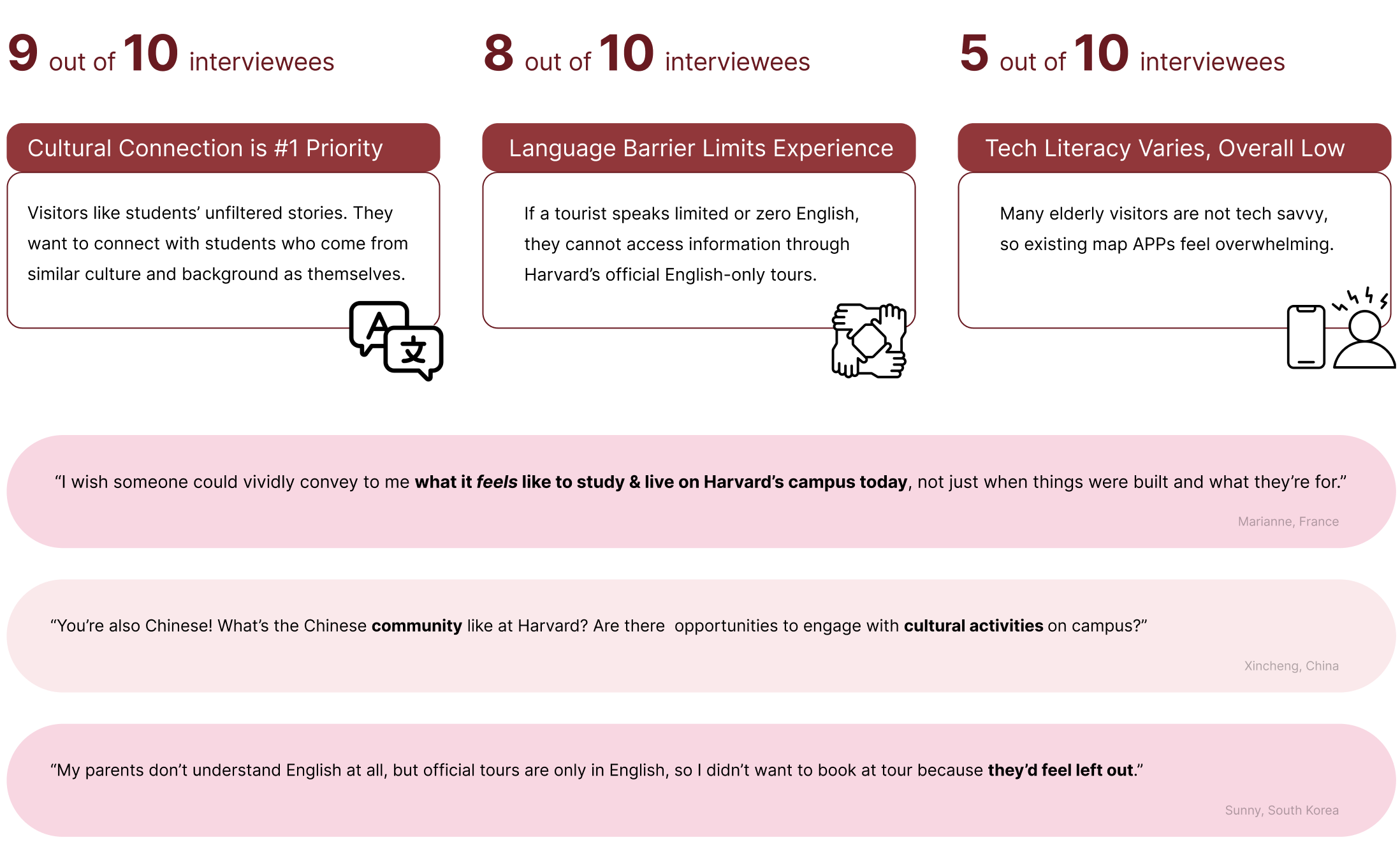
Of Harvard's 8M annual visitors, 240K are international retirees, many of which come from non English-speaking countries. While visiting Harvard:
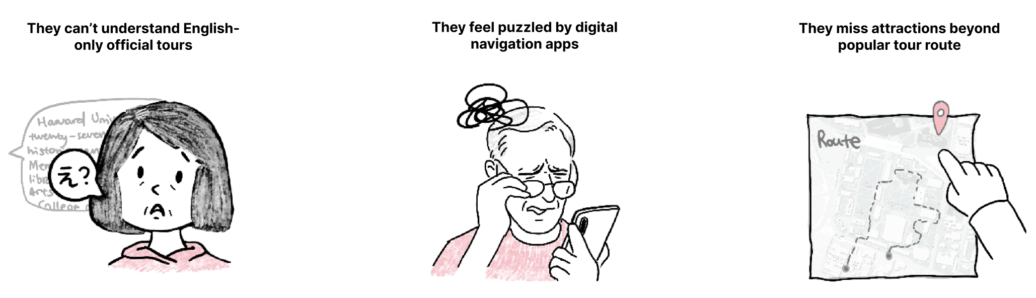
These 3 pain points framed our initial assumption: Visitors need a solution that offers better translation and more tour options on a minimalist interface. HOWEVER…
Our first hypothesis was quickly tabled after we talked to 10 retired international travelers in-person. Their stories revealed that, while the 3 pain points hold true, our target users don’t need another translation app. Instead, their top-1 need is authentic, meaningful connections with Harvard’s students and culture.
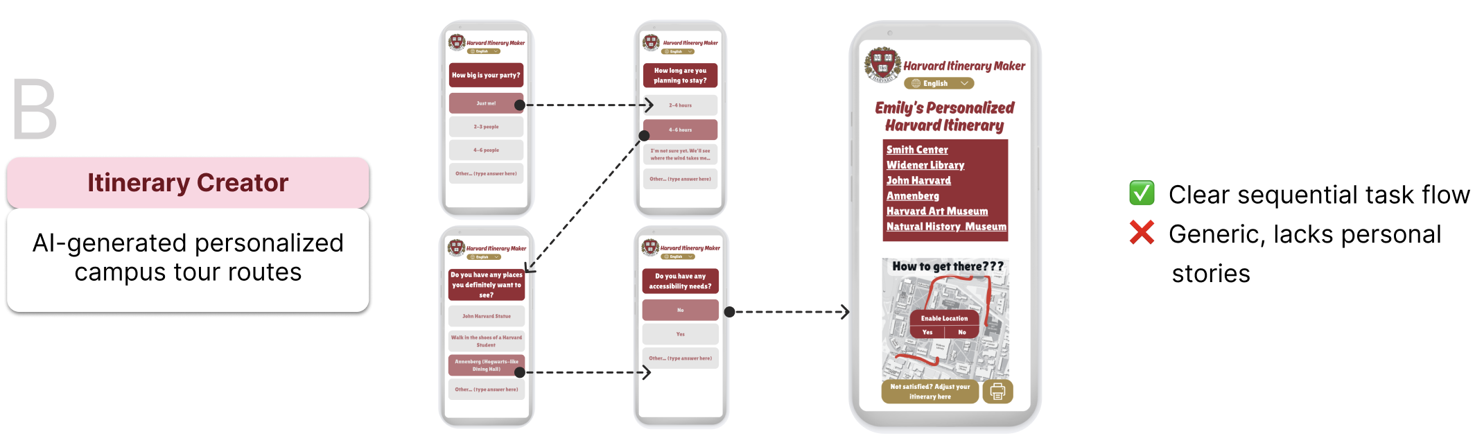
Choosing Solution Approach: Marketplace vs. AI
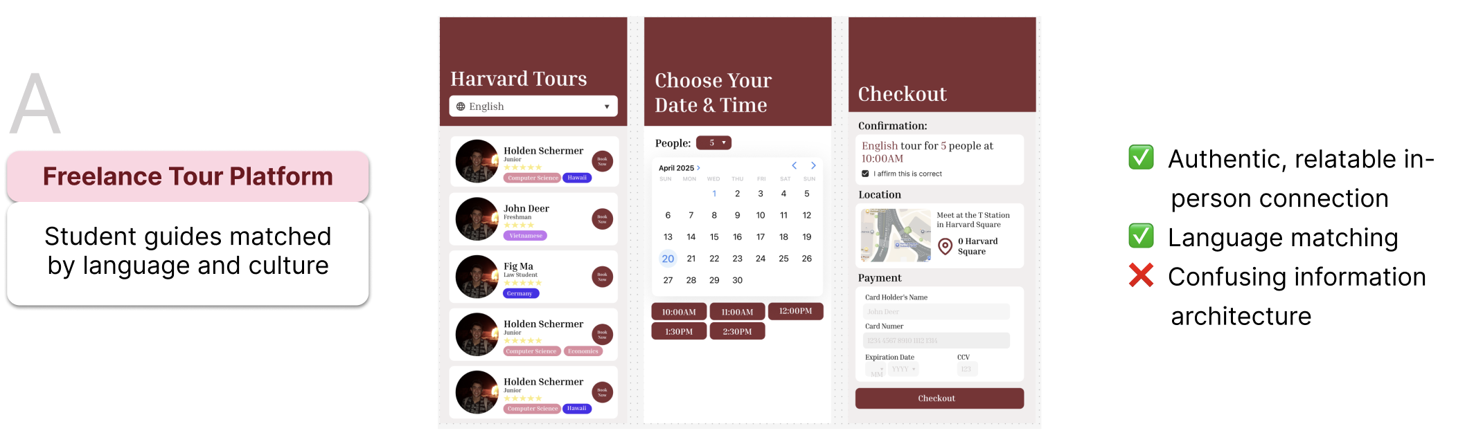
Decision: Combine the Strengths of A & B
A (Marketplace): offers personal connection and language match
B (Sequential flow): offers clear, elderly-friendly steps
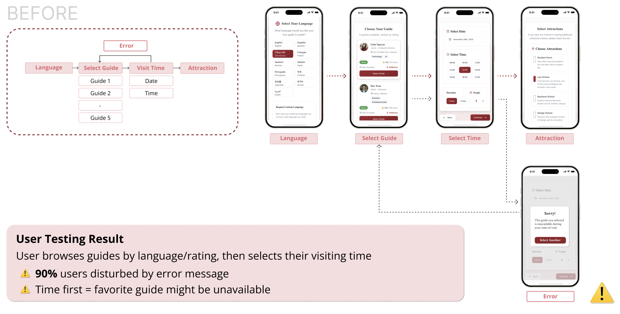
Booking Flow: Guide-First vs. Date-First
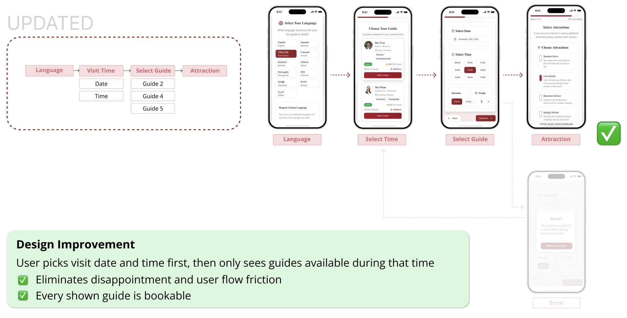
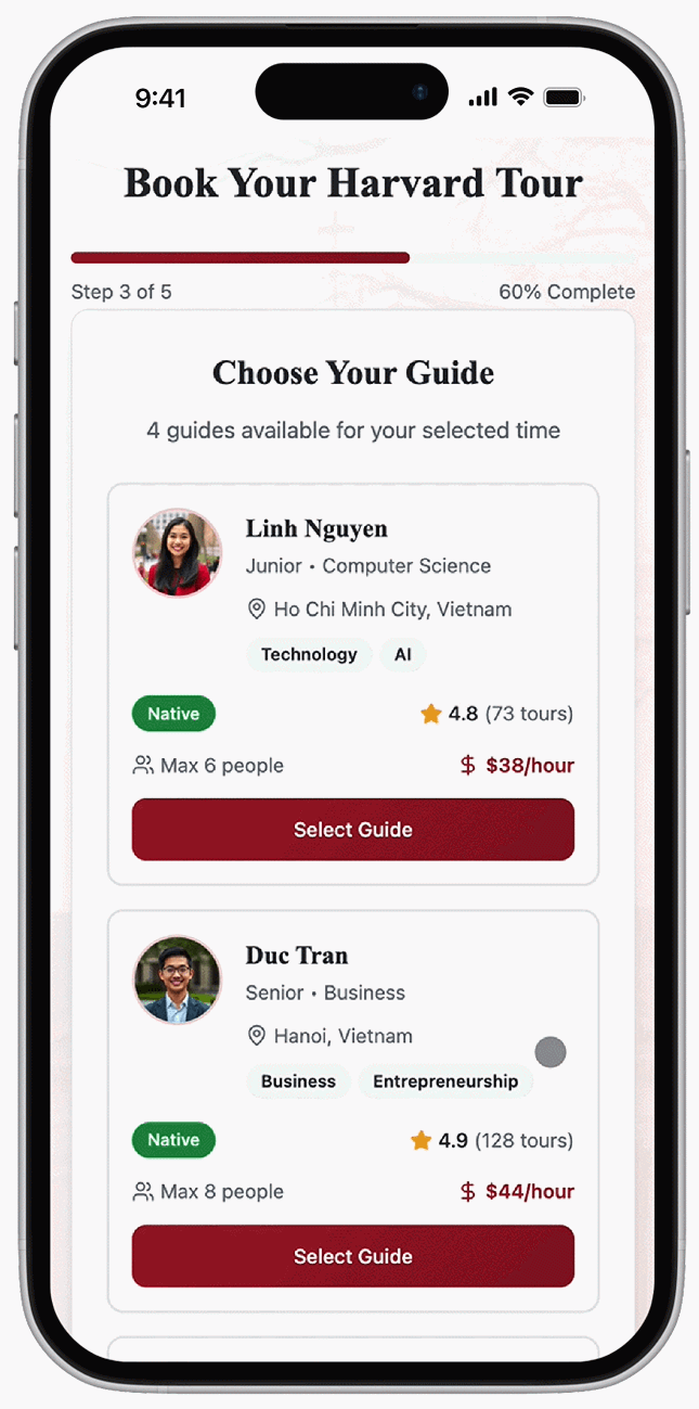
Decision: Select visit time first, then student guide
After iteration, users select visit time first, then guides. Testing this alongside our previous design, 8/10 users completed booking action.
Final Solution
Core Features
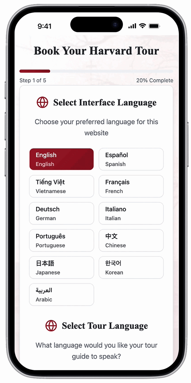
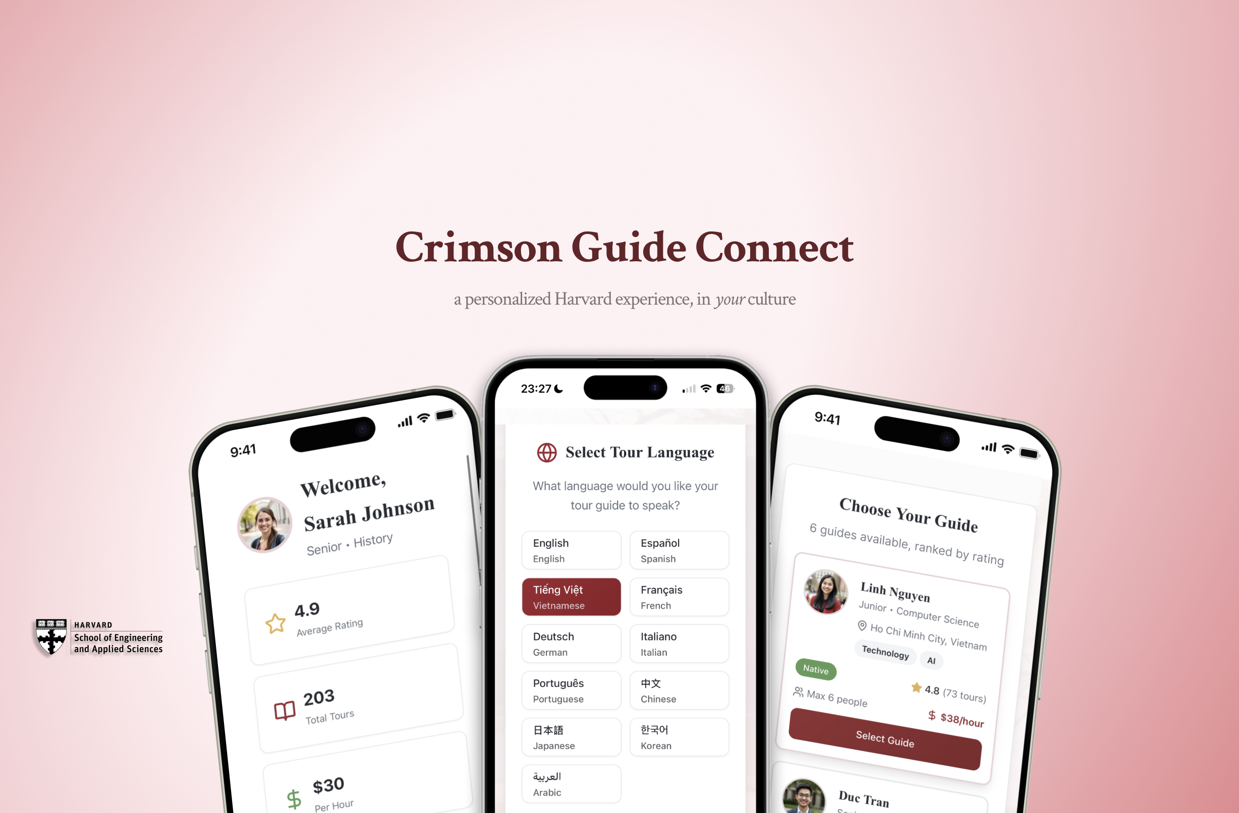
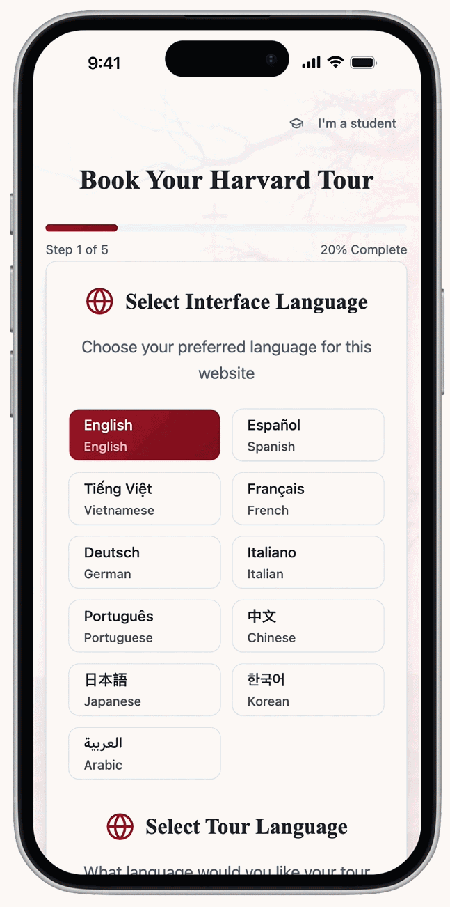
A 5-step, web-based booking platform that matches international retirees with Harvard students who speak their language.
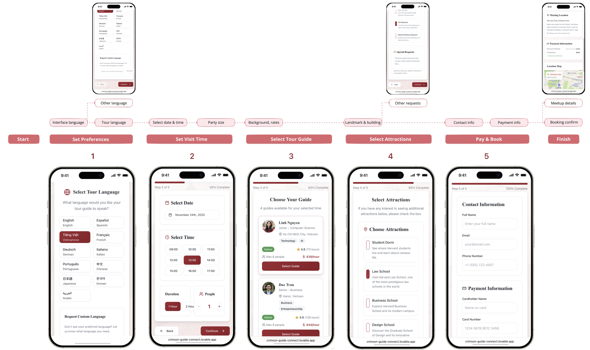
Browse Profile & Interests: Customize tour with guides who share your heritage and interests.
Guide Portal: Students manage availability and pricing in their dashboard.
Outcome
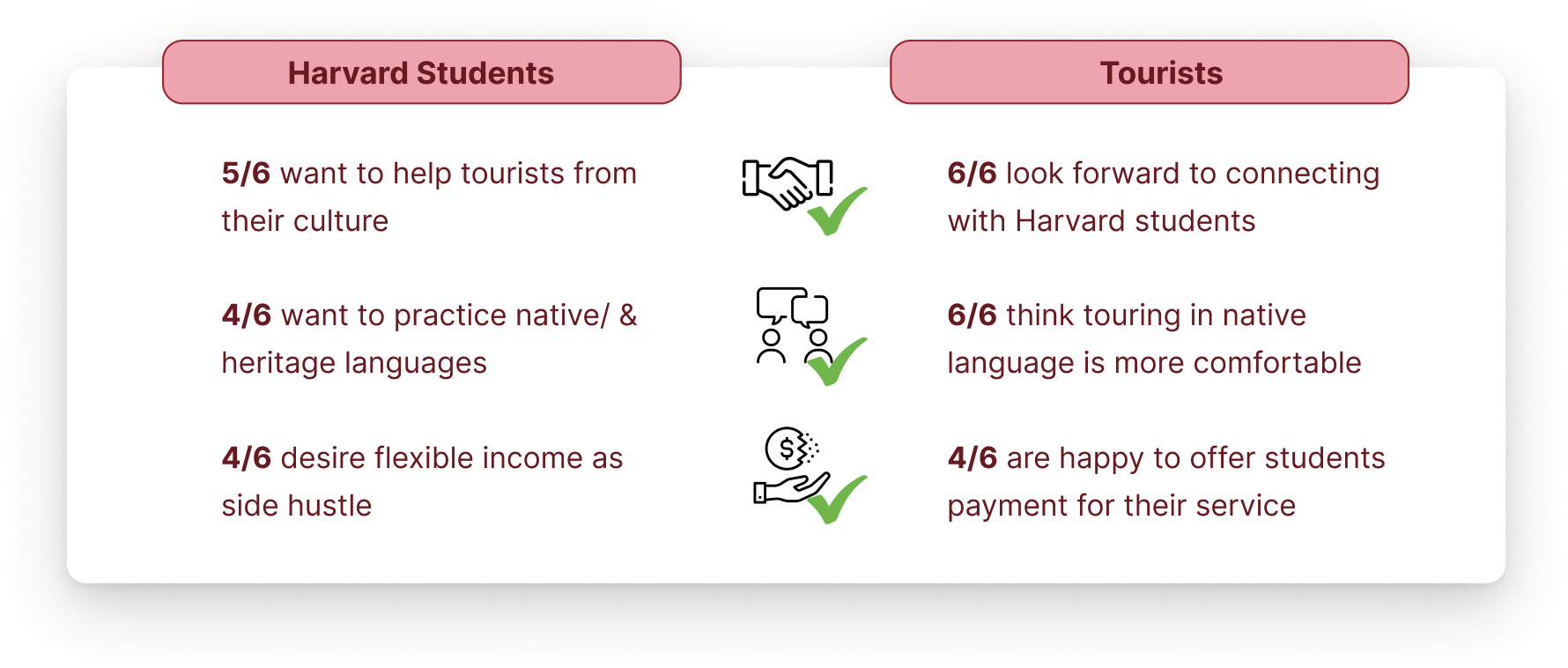
Interviewing 6 Harvard students and 6 new international tourist groups validated demand on both sides, confirming two-sided marketplace viability.
Our first wireframe lets users “select guide” first for highest profile compatibility. But users were confused by unavailable dates.
Showcased as top-4 project among 16 teams.
Market Validation:
100% tourist & student booking intent
Projected market: 12K bookings/year = $360K marketplace value
Impact:
Two-sided marketplace creates mutual value for tourists and students
Uncover the “why,” not just the “what”
Our initial assumption about our users’ needs was challenged, proving that design must begin with data-supported research.
Foster human connection, not replace it
AI usage should be case-specific. We leveraged human elements for genuine connection rather than relying on AI, which is powerful but doesn’t give the human connection users ask for.
Optimize usability, not sacrifice function
We strategically combined design concepts for efficiency and clarity in the final workflow.
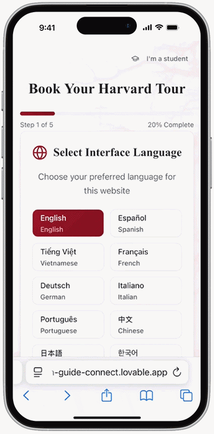
5-Step Booking: From language selection to confirmed tour in under 3 minutes.
Updated Insight Validation
Method:
Field research in Harvard Yard. We spoke languages we knew, or used Google Translate to communicate with tourists
Two-Sided Marketplace Validation
Method:
Round 2 of in-person field research in Harvard Yard
Design Decision 1:
Method:
Rapid prototyping 4 distinct solutions, then finalizing top 2 impactful designs
Design Decision 2:
Method:
Usability testing with 10 elderly tourists
Takeaways
To help retired international visitors overcome language barriers and form meaningful connections with Harvard culture, I designed Crimson Guide Connect ↗.
Crimson Guide Connect is a web-first booking platform matching international retirees with Harvard student guides who share their language, culture, and hobbies. This transforms language barriers into personalized, genuine campus connections.
My Role:
UX Designer & Researcher
Pitch Deck Designer
Timeline:
4 weeks, Fall 2025
Tools:
Figma, Procreate, Lovable
Collaborators:
PM: Emily Helms
SWE: Holden Schermer
Language-First Matching: Select language and time to instantly see available guides who speak it fluently.